Templates

Wednesday, 22 December 2010 by pijulius, 3280304 views

Shopping / Templates

Tuesday, 5 July 2011 by pijulius

Templates allow you to change the look of your website anytime, they even allow you to change the admin section's design too. You will also receive full support for templates ordered from jcore.net!

Sleek Portfolio by Photoshop Plus
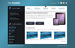
Thursday, 14 July 2011 by pijulius, 662168 views, Stock: available
Sleek Portfolio
Sleek Portfolio
Thursday, 14 July 2011, 72709 views

This sleek portfolio template is a port to jCore from a great PSD tutorial created by Richard Carpenter at Photoshop Plus. It implements a twitter box for your latest tweets, a latest poll on the sidebar.

To modify the social bookmark icons and the twitter feeds please see the Layout Blocks in admin and edit their contents under Content Options. To define sub titles for the menus just edit the menu item and add a <span> html tag around your sub title like "Home <span>The Starting Point</span>".

Attachments (click to download)
Sleek Portfolio ver. 1.0 (624 KB)
gzip compressed data, from Unix, last modified: Thu Jul 21 14:55:17 2011, 70535 downloads, uploaded on Thursday, 14 July 2011

Comments (12)

Avatar
Very good this template!
Congratulations!
Friday, 25 November 2011 (#221) by Super Site Fácil
Avatar
two slashes in menu (urls) - only in this template. for example :
domain.com//what-next
domein.com//home
domain.com//any-menu-item

how to fix ?
Friday, 2 December 2011 (#225) by albus
Avatar
Could you please show me an example of this? I can't seem to be able to replicate it here, it should be working just like with other templates as templates don't touch the way menus are printed out so this is really strange.
Wednesday, 7 December 2011 (#226) by pijulius
Avatar
sorry, its not template, it happens when i add russian language in language list and change pages to russian. i named a language in russian letterts thats why i have site//home , if i name a language in english letter for ex. "ru" everything is ok - link becomes site/ru/home
Friday, 16 December 2011 (#227) by albus
Avatar
Hello !
To the template author: It's a very nice template, congratulations.

But, in your CSS, why did you set "min-height: 1300px;" on #website-bg ?
On a fresh install, it's a little ugly and make the page longer than needed :/
Thursday, 24 May 2012 (#243) by max13
Avatar
Thanks, happy you like it, regarding the min-height, if I remember it right I set it because of the main background, if you set it to a lower number and maximize your window to be bigger than the website does it still look good with the blue background? I think it will cut it down.
Thursday, 24 May 2012 (#244) by pijulius
Avatar
Oh, I'll Check that tomorrow.

What about the upper left corner website logo? Couldn't you set it as a normal text (same as website title for example), with a nice typo (even a webfont)

Regards ;)
Thursday, 24 May 2012 (#245) by Max13
Avatar
Yes, it could be done, will check out this idea in the future but if you come up with something please don't hesitate to share with us :)
Thursday, 24 May 2012 (#246) by pijulius
Avatar
Hey!
Concerning the layout of the background, I can't see anything ugly. I have a 13" macbook pro, I can't maximize a lot the window to see.

Maybe you can check it? : http://rihan.fr/

Thanks.
Wednesday, 30 May 2012 (#247) by max13
Avatar
Hmm, I just checked it and yes, unfortunately the bottom gets cut off if there is no min-height set.

You can verify yourself, just remove the min-height and then open a page that has no content at all (is smaller than your window so the scrollbar won't be activated in your browser) and you should see the problem on the left bottom.
Thursday, 31 May 2012 (#248) by pijulius
Avatar
Okay...
What do you think about using a 2 or 4 pixels square, as a pattern that you repeat on X and Y ?

Wouldn't it be a better rendering ?
Monday, 4 June 2012 (#249) by max13
Avatar
The pattern is just fine, it's the second background that has the linear fill of light that goes from dark to light and back to dark and finally gets the same as the background pattern, and because of this image you have to have this height.

If you don't wish to have that linear fill just simply drop it and keep the body background and that's all.
Monday, 4 June 2012 (#250) by pijulius
Only registered users can comment.